The WordPress Twenty-Twenty-Three theme is built with a clean and modern design, but one missing thing is an option to customize the mobile menu breakpoint through the theme settings. This is why I am here with this article where I will guide you through the process of customizing the mobile menu breakpoint using custom CSS.
Before I’ll share the code, we will talk about some other important things. So, stay tuned with this article.
Check our – WordPress Twenty Twenty-Three Theme Tutorial
Contents
Change Mobile Menu Breakpoint Of WordPress Twenty-Twenty-Three Theme
Understanding Mobile Menu Breakpoints
Before we dive into the customization process, let’s briefly discuss the concept of mobile menu breakpoints. Well, the breakpoints define when the layout of a website changes as per the different screen sizes. In responsive website design, the breakpoints play a very important role in ensuring a seamless responsive design.
Identifying Limitations in Twenty-Twenty-Three Theme
While the Twenty-Twenty-Three theme excels in many aspects, but it lacks to provide a built-in option to adjust the mobile menu breakpoint through the theme editor. This limitation may be noticeable only when you refine the appearance and functionality of your website’s mobile menu.
Overview of Custom CSS for Mobile Menu Breakpoint
To overcome from this mobile menu breakpoint limitation, we can leverage custom CSS. The provided CSS code snippet targets the mobile menu and adjusts its behavior based on screen width. The code focuses on two main aspects such as the hamburger button and the full menu.
@media screen and (max-width: 767px) {

  .wp-block-navigation__responsive-container-open  {
    display: block !important;
  }

  .wp-block-navigation__responsive-container:not(.is-menu-open.has-modal-open) {
    display: none !important;
  }
}
If you want to hide the desktop menu from the tablet then this breakpoint is perfect. As per the media query of max-width: 767px, it will show the desktop menu to 767px and then it will show the mobile menu.
If you want to change the breakpoint then you need to simply modify this code only – @media screen and (max-width: 767px). For instance, if you want to show mobile menu from the 1000px then you need to customize the code like this – @media screen and (max-width: 1000px).
Wait!
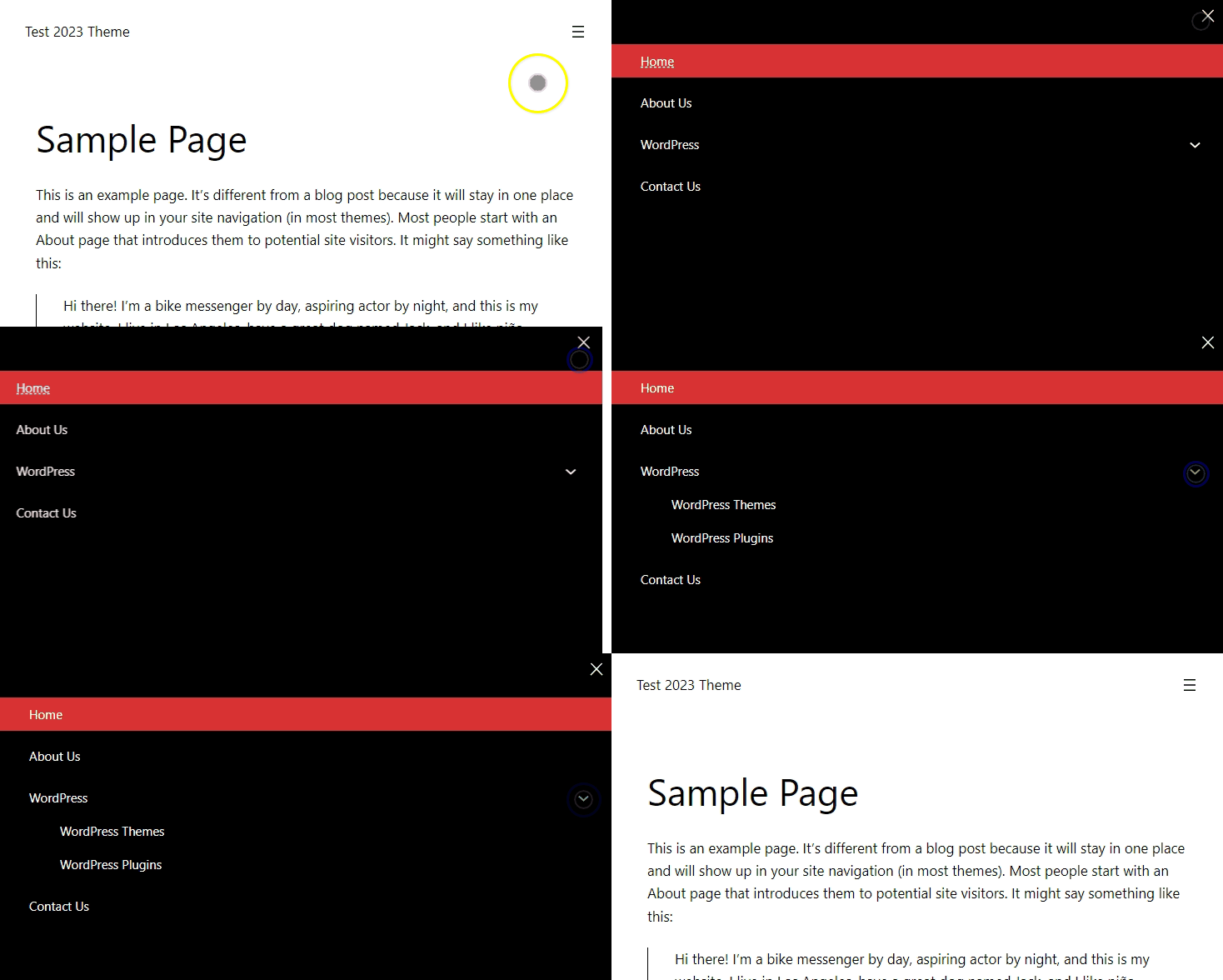
There is another thing that many of you might not like and that is its look and feel. Also, the thing I’ve noticed is that all the sub menus remain open and there is no toggle button to show/hide them. So, here I’ve also fixed that issue and created a code that help you out with this.
So, the below CSS code is to better its look and feel while the JS code is for the sub-menu toggle button.

If you want to change the mobile menu color like the black bg color or red color, then you need to modify the CSS code where I have mentioned the black bg color and red bg color.
Note: if you want to use the below CSS code then don’t add the above CSS code.
CSS Code
@media screen and (max-width: 767px) {

  /* Override existing styles for hiding the submenu */
  ul.wp-block-navigation__submenu-container {
    display: none !important;
  }

  /* Show the submenu when the 'open' class is applied */
  li.wp-block-navigation-submenu.open ul.wp-block-navigation__submenu-container {
    display: block !important;
  }

  /* Adjust styles for the submenu icon */
  .wp-block-navigation ul {
    width: 100%;
  }

  .wp-block-navigation-submenu .wp-block-navigation__submenu-icon {
    display: inline-block !important;
    margin-left: 5px !important;
    position: absolute;
    right: 3%;
    top: 5px;
    width: 2em;
    height: 2em;
  }

  .wp-block-navigation-submenu .wp-block-navigation__submenu-icon svg {
    width: 1em;
  }

  /* Adjust styles for the responsive container */
  .wp-block-navigation__responsive-container.is-menu-open {
    display: flex !important;
    flex-direction: column !important;
    padding: 0px !important;
  }

  .wp-block-navigation__responsive-container.is-menu-open .wp-block-navigation__responsive-container-content .wp-block-navigation__submenu-container,
  .wp-block-navigation__responsive-container.is-menu-open .wp-block-navigation__responsive-container-content .has-child .wp-block-navigation__submenu-container {
    padding-top: 0;
  }

  .wp-block-navigation__responsive-container:not(.hidden-by-default):not(.is-menu-open) {
    display: block;
    width: 100%;
    position: fixed;
  }

  .wp-block-navigation__responsive-container-open:not(.always-shown) {
    display: flex;
  }

  .wp-block-navigation-item {
    width: 100%;
  }

  .wp-block-navigation__responsive-container {
    background: #000000 !important; /*Black bg color*/
    color: #ffffff !important;
    transform: translateX(-100%);
    width: 100%;
    height: 100vh;
  }

  .wp-block-navigation__responsive-container:not(.hidden-by-default):not(.is-menu-open) .wp-block-navigation__responsive-container-close {
    display: block !important;
  }

  ul.wp-block-navigation li.current-menu-item>a,
  ul.wp-block-navigation li li.current-menu-item>a {
    background-color: #d93134; /*Red bg color*/
    color: #ffffff !important;
    transition: background-color .5s;
  }

  .wp-block-navigation .wp-block-navigation-item__content {
    display: block;
    padding: 0 5% !important;
    line-height: 40px;
    width: 100%;
  }

  .wp-block-navigation__responsive-container.is-menu-open .wp-block-navigation__responsive-container-content .has-child .wp-block-navigation__submenu-container {
    width: 100%;
    padding: 0 5%;
  }

  .wp-block-navigation__responsive-container-content {
    gap: 10px;
    padding-top: calc(2rem + 24px);
  }

  .wp-block-navigation__responsive-container.is-menu-open {
    transform: translateX(0);
    transition: 0.3s ease-out;
    animation: none !important;
  }

  .wp-block-navigation__responsive-container:not(.is-menu-open) {
    transform: translateX(-100%);
    transition: 0.3s ease-in-out;
    animation: none !important;
  }

  .wp-block-navigation__responsive-container.is-menu-closed .wp-block-navigation__responsive-container-close {
    display: none;
  }

  .wp-block-navigation__responsive-container-close {
    display: block;
    position: absolute;
    right: 10px;
    top: 10px;
    z-index: 2;
    cursor: pointer;
  }
}
JS Code
<script>
    document.addEventListener('DOMContentLoaded', function () {
  var mobileMenu = document.querySelector('.wp-block-navigation__responsive-container');
    var submenuButtons = document.querySelectorAll('.wp-block-navigation-submenu');
    var mobileMenuCloseButton = document.querySelector('.wp-block-navigation__responsive-container-close');
    var submenuLinks = document.querySelectorAll('.wp-block-navigation-submenu a');

  if (mobileMenu && submenuButtons.length > 0 && mobileMenuCloseButton && submenuLinks) {
        // Event listener for submenu buttons
        submenuButtons.forEach(function (submenuButton) {
            submenuButton.addEventListener('click', function (event) {
                event.preventDefault();
                event.stopPropagation();

                // Toggle the 'open' class for the clicked submenu
                submenuButton.classList.toggle('open');
            });
        });

    // Event listener for closing the submenu on mobile menu close button click
    mobileMenuCloseButton.addEventListener('click', function (event) {
        event.preventDefault();
    event.stopPropagation();

    submenuButtons.forEach(function (submenuButton) {
        submenuButton.classList.remove('open');
      });
    });

    // Event listener for submenu links
    submenuLinks.forEach(function (link) {
        link.addEventListener('click', function (event) {
            // Allow the default behavior of the link
            // Stop the event propagation to prevent toggling the parent submenu
            event.stopPropagation();
        });
    });

    // Event listener for document click to close all submenus
    document.addEventListener('click', function () {
        submenuButtons.forEach(function (submenuButton) {
            submenuButton.classList.remove('open');
        });
    });
  }
});
</script>
Final Thoughts
Finally, we are wrapping up here and I hope that this article will be helpful for you. Still, if you are facing any other issue of this twenty twenty three theme then simply share with me by commenting below and I’ll try to solve that issue like the mobile menu.
If this tutorial helps you then share it with your friends on your social media.


