Have you heard about CSS Framework? What Is It?
The CSS framework contains a stack of CSS code which you can use for your web and mobile app development projects. The main intention of using this framework is that you can complete your project faster and easier.
A few years ago web designers and developers do lots of work because that time there is nothing like these types of framework. So they have to do all the things from scratch for all projects. And nowadays people want responsive websites also. But when these frameworks are come it has change web designers and developer’s life. It is because this framework comes with responsive also and it gives you dozens of components to create easily Grids, Buttons, Forms, Typography, Tables, Menus, Alerts, Progress bar and much more.
For using this framework first you will have to understand about how to use it. If you are familiar with css then you will easily understand how to use it and if you are not familiar then it will take time, but once you will understand properly then you can use it easily for your all projects and then you don’t have to create different css for different projects from scratch and you will complete your projects before the deadline.
Ok so now don’t talk too much about this, I want to introduce the top 10 css framework to speed up your coding.
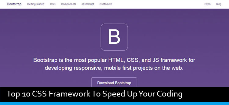
1> Bootstrap
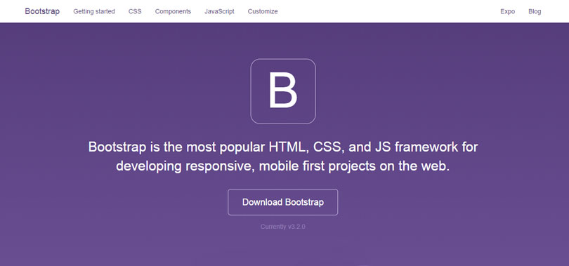
Bootstrap is one of the best and most popular HTML, CSS and JS framework and it is the first mobile project on the web. Bootstrap develop with the two most popular CSS preprocessors, Less and Sass. It offers you number of cutom HTML and CSS components and jQuery plugins.
Bootstrap made for folks of all skill levels, devices of all shapes, and projects of all sizes.
2> YAML
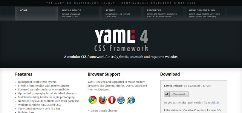
YAML (Yet Another Multicolumn Layout) was released in October 2005. It is a modular CSS framework for truly flexible, accessible and responsive websites. One of the important part is that it is tested and supported in latest browsers. If you want to use this framework then you will need a license.
YAML target on developing flexible layouts, with solid focus on faces the challenges for elastic and fluid layouts. It offers you grids, navigation, forms, typography module and much more.
3> Pure
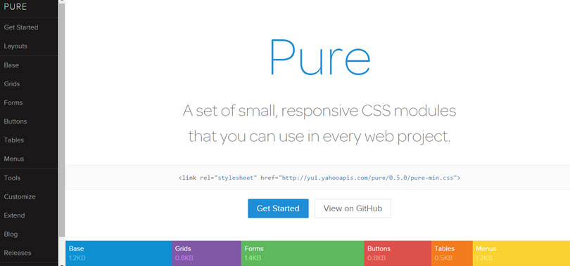
Pure is a small size of framework. It is develop with mobile devices in mind, it was important to us to keep our file sizes small, and every line of CSS was carefully considered. If you decide to only use a subset of these modules, you’ll save even more bytes.
4> Cascade Framework
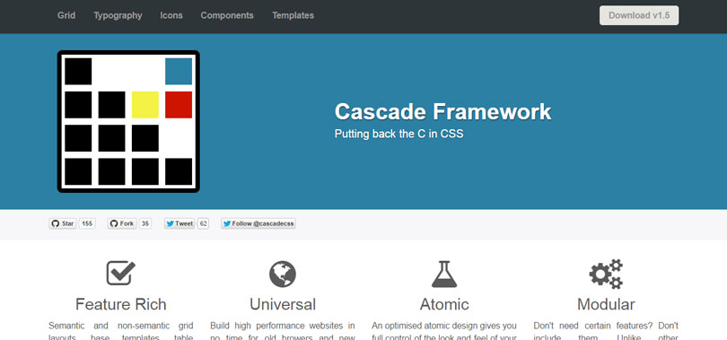
Cascade Framework is inspired by Twitter Bootstrap but it’s not just another replicated twitter bootstrap. Twitter Bootstrap focused on provide shiny user element that you can put any of your project and takes control of your project’s overall look-and-feel, when Cascade Framework is intended to do the opposite. It splitting your CSS into separate files based on features rather than selectors as well as by implementing atomic design, Cascade Framework puts you in control!
5> Gumby
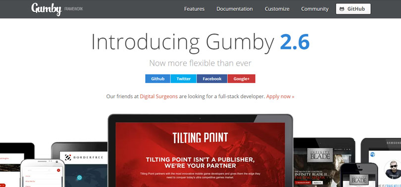
Gumby is built with the power of Sass. Sass is a powerful CSS preprocessor which allows us to develop Gumby itself with much more speed — and gives you new tools to quickly customize and build on top of the Gumby Framework.
6> Kube
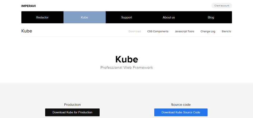
Kube is one of the world’s most advanced and flexible frameworks. Kube helps you spend less time on routine tasks and more time creating amazing products. Focus on success, and Kube will cover the technology behind it.
7> Skeleton
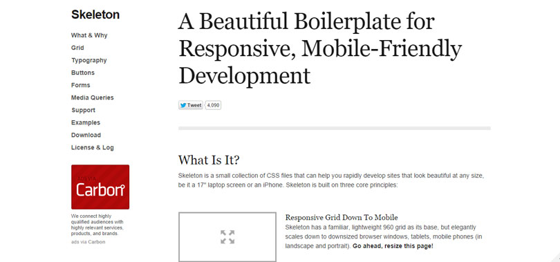
Skeleton is a tool for rapid development. Get started fast with CSS best practices, a well-structured grid that makes mobile consideration easy, an organized file structure and super basic UI elements like lightly styled forms, buttons, tabs and more.
8> Responsee 2
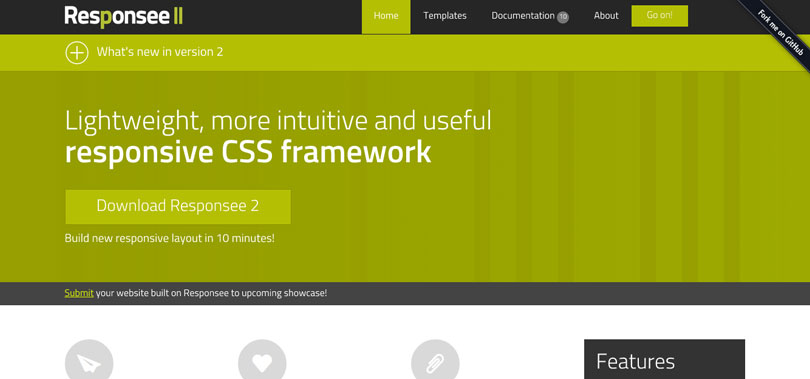
Responsee is an open source responsive CSS framework based on 12-column grid. Websites based on Responsee are fully responsive – they display content correctly on each type of devices. Besides basic CSS file also supplementary files of components are part of Responsee.
9> UIkit
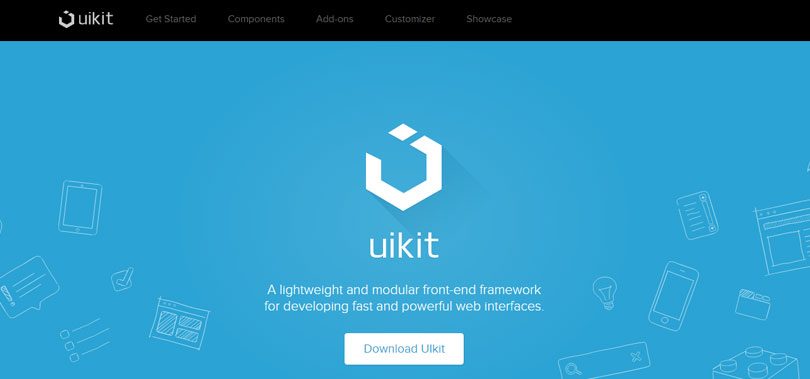
UIkit offers over 30 modular and extendible components, which can be combined with each other. Components are divided into different compartments according to their purpose and functionality.
10> IVORY
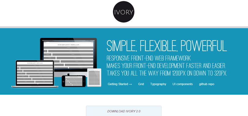
IVORY is Simple, Flexible, Powerful Responsive Front-End Web Framework Makes Your Front-End Development Faster And Easier. Takes You All The Way From 1200px On Down To 320px.